WARNING: This section is intended for advanced users and "Super users" of PRIM Logix.
The configuration items presented in this section may indeed have an impact on your operations.
If in doubt, consult your system administrator.
Please note that only users in the appropriate security groups can access the software configuration windows.
List of colors (CFG034)
This window is designed to help you better manage the themes available in PRIM. It allows you to pair a color from the default theme (Colorful Theme) with a color that works in the dark theme. This way, for each color that exists in the Colorful Theme, you can choose a different color that will work in the dark theme. Since many colors are customizable in PRIM (status colors, interface element colors, etc.), this ensures that a color defined in the default (Colorful) theme will have a suitable equivalent in the dark theme.
Overview of the Window
The window is divided into two sections:
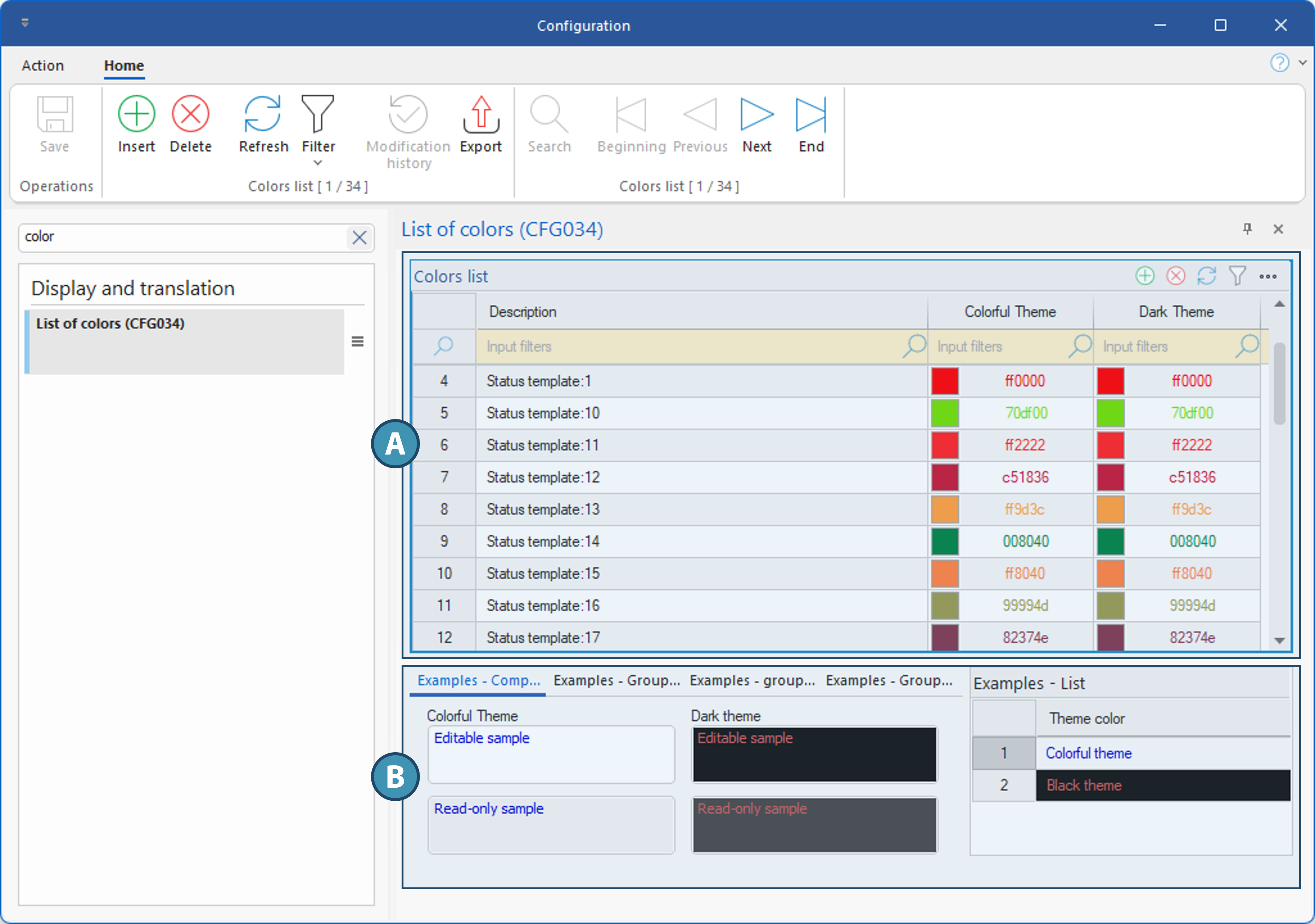
Colors List (A)
This section, in table format, lists the color palettes available in PRIM, along with the color used for each theme. Most palettes correspond to the colors used for statuses, but these same colors may also be used elsewhere. An explanation of the different columns in this table is provided below.
Description: This is simply a label—the name of the color scheme. Since most colors in our default configuration are used in statuses, this is why most descriptions begin with “Status template.”
Colorful Theme: When this color palette is selected for an element, this is the color applied if the user chooses the colorful theme, the default theme in PRIM.
Dark Theme: When this color palette is selected for an element, this is the color that will be applied if the user chooses the dark theme.
Examples (B)
In the lower section, the various tabs allow you to view the result when these colors are used for the different objects and interface elements in PRIM, as well as the result in a list for those same elements. Each element is shown in a separate tab:
•Examples - Components
•Examples - Grouping Text
•Examples - Grouping Line
•Examples - Group Box
•Examples - List
Add or Modify a Color Palette
If you want to use colors other than those included in the default configuration—for example, to use your brand colors—you can modify existing palettes or add a new one as follows:
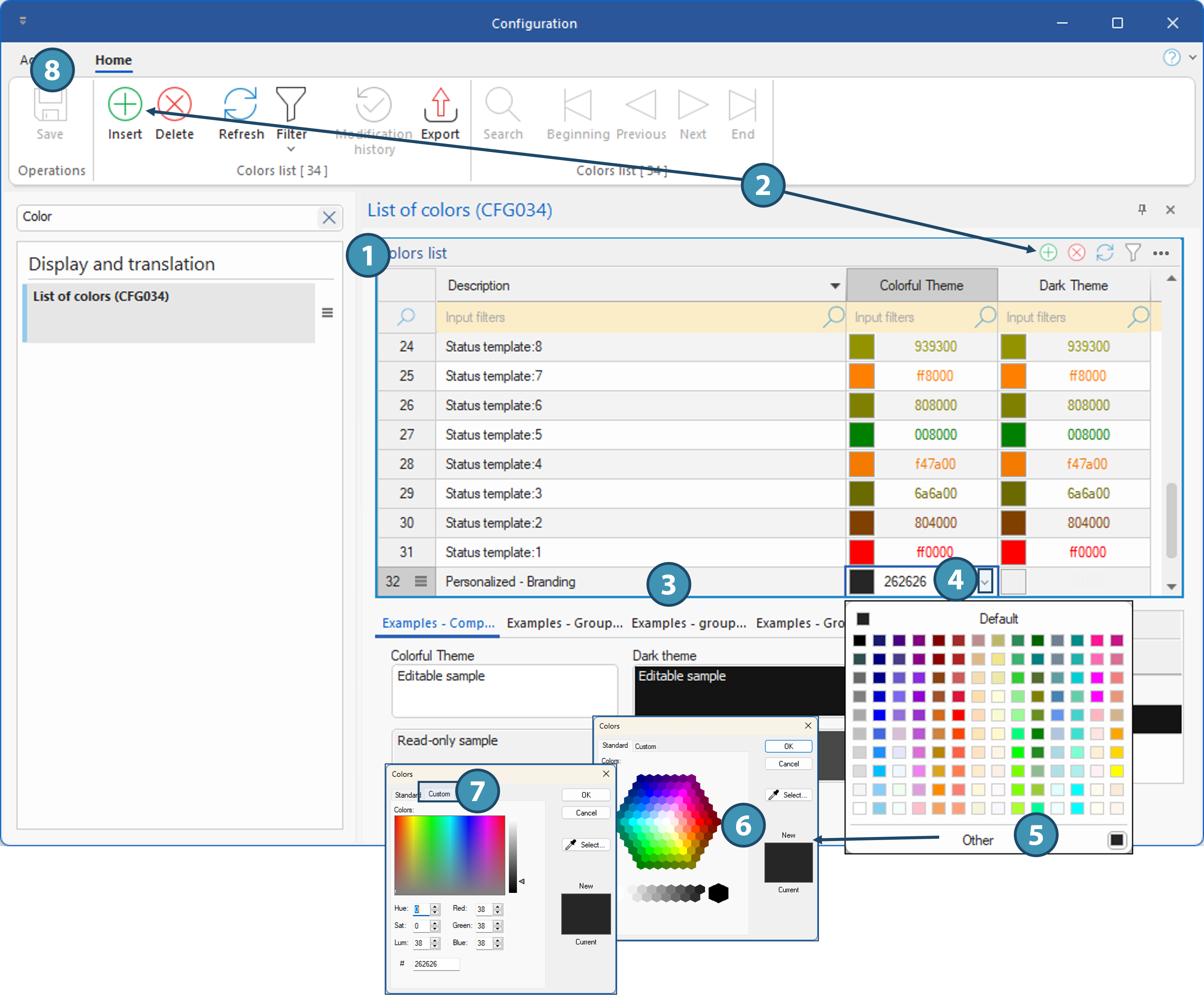
1.Click in the Color List table.
2.From the Home ribbon or from the advanced grid or table features menu, click “  ” to add a row to the table. The row is added at the end.
3.In the "Description" column, enter the desired description and save. By default, the colors black (Colorful Theme) and white (Dark Theme) will be selected.
You must save before setting the colors; otherwise, you will lose the description you entered.
4.For each theme, to change the defined color, click in the corresponding field. If you know the hexadecimal (HEX) code for the desired color, you can type it directly into the field; otherwise, use the drop-down menu to view the color palette and select a color.
5.If you cannot find a suitable color among those displayed, click “Other.”
6.In the window that appears, use one of the colors from the palette, or to select a color from another document, use the eyedropper (Select).
7.To use a different color system to define the color (RGB, CMYK, color swatch), click the " Custom" tab.
8.Once you’ve set the color for each theme, save again.